I visited the Yale Center for British Art on January 26th. It was a rainy day, however it was a great day to spend inside and enjoy beautiful works of art. This museum was relatively small and unfortunately only two floors were available for viewing. However, those two floors had amazing pieces. Many of the pieces on the fourth floor were portraits and landscapes. Each one of these, although similar in the type of composition, were all extremely different. They each had their own personality and created unique and very interesting pieces. When one looks at the map for the fourth floor, one can see that the whole floor is split into certain sections. For example, there was a Hogarth section, an Early Victorian England section, History Paintings, and more. Some of the sections had massive paintings that a person would really have to stand far back in order to get the full picture. Those were some of my favorites because I could get close and see the detail and the large pictures were very inspirtational. The time and dedication it must have took to create these peices is very inspiring. The third floor did have a special exhibit, however, pictures were not allowed. I was able to get two pictures with a guard's permission. My mother joined me during my trip. She loves art, especially art that has realism. She does not get a lot of abstract art which is fine by me because I get to try and explain what I see and it helps me to learn and her thoughts and knowledge about classic or realistic art teach me more than I could have learned on my own.


The front of the building has sort of an underpass to the door where the second floor of the building comes out further than the first. I couldn't get a good picture of that because of the rain, but you can see in the second picture a view of it from underneath. The lobby is very open and the lady at the desk if very helpful.

When I walked through the elevators and turned into part of the gallery, this is the first painting that I saw. I grew up on a horse farm in Cheshire and so I imediately thought of my childhood when I saw the horses. This painting is by Sawrey Gilpin and is called Gulliver Taking His Final Leave of the Land of the Houyhnhnms. Gilpin created this piece in 1769 with oil and canvas. The horses were called houyhnhnms and are in the fourth part of the story of Gulliver's Travels. The painting shows part of the story where the houhnhnms allow Gulliver to build a boat so that he can leave their land. I loved the detail in this painting and the dark shadows.

The next painting that I looked at was by an artist named Thomas Gainsborough. The painting is called William Johnstone-Pulteney, Later 5th Baronet. It was created with oils on canvas in 1772. William Johnstone was a property developer and member of the Parliament. This painting was made while he was creating the Pulteney Bridge. Normally when I think of portaints like these, I think of them being inside. I thought this was quite unique in that there are trees and a beautiful landscape behind him.


I really enjoy looking at landscapes and paintings with nature in them. Each one I feel is very unique and different, this one in particular I thought was really beautiful and the details in the leaves and the glares and ripples on the water were facinating to me. The change of the weather in this painting was also amazing to me, that it could be caputred so well in a painting. The artist, John Constable painted this using oils in 1826. It is called Parham Mill, Gillingham. Constable did the painting at a request by Mr. Tinney, the owner who wanted a view of Salisbury as well. Before he was able to create this painting, the mill had burnt down and therefore had to rely on a friend's drawings on the mill.

This was another landscape painting that I found to be very interesting. I felt that the view of the land on the right was beautiful and the ruins on the left created a darkness to the painting more than the actual shadows on the right. To me, it symbolized destruction and therefore brought a sadness to the painting. However, the people in the painting and the brightness around the people and animals in the middle brought hope. This painting was created by John Constable as well and he used oil on canvas for this painting as well. It was created in 1829 and called, Hadleigh Castle, The Mouth of the Thames- Morning after a Stormy Night. This painting was created during a time of Constables life when he was extremely depressed because of the death of his wife. So his pain and suffering was put into this painting and you can really feel that sorrow.

This is a painting created by John Glover in 1827. He was a man who liked to travel around Britian looking for breathtaking views to paint. What I thought was interesting was that he had two club feet and was overweight which made it even harder for him to travel. However, dispite his complications, he was able to find a georgeous view of this beach from a cliff. I love the beach and I love how the sky looks in this painting. There are very dark clouds in the painting however, the bright sun is still shinning through. This painting was made on canvas with oils and is called Sandown Bay, from near Shanklin Chine, Ilse of Wight.


Close up of the boats and the reflection.

This painting, created by Joseph Mallord William Turner in 1818, is called, Dort or Dordrecht: The Dort Packet-Boat from Rotterdam Becalmed. The painting was done on canvas with oils. I found this painting to be remarkable because of the detail in it. Looking at the close up, the expressions of the people and the shading on their clothing is amazing. Also, the reflection in the water of the boat seems to be almost flawless. Even just the shine on the boat adds to the beauty on the piece. The painting shows the men exchanging food and drink with eachother while waiting for the winds to pick up so they could continue their journey.

The frame was hand carved.


Close up of the bottom, middle of the frame.

Close up on the top of the frame.
As I was looking at another painting, I overheard a guard speaking to a woman about this piece. He told her how the frame was hand carved; I was intregued. When I looked at it, it was almost as though the frame completed the painting as though the man on top is God looking over the turmoil of the events happening below him. And the chaos of the framework mirrors the chaos within the painting and the battle. This painting was made my Samuel Scott in 1749 on canvas with oil and is named, Vice Admiral Sir George Anson's Victory off Cape Finisterre. In the painting British and French fleets are at war and eventually, the British are successful in capturing the entire fleet.


Close up of the detail in his face.
When I first saw this painting, I was a little confused because in my opinion, I thought that this man looked like George Washington. In fact, the painting is called, Admiral Lord Bridport and is Alexander Hood. The events that he is pointing at is his greatest moment when he led an action against the French and succeeded by engaging them from both sides and was able to capture three ships. The painting was made with oils on canvas in 1795 and I thought that the way he painted the face was amazing. At first glance, Bridport's face looks so realistic, the details and shading are amazing.


When my mother looked at this painting she said that it looked perverse. I found that rather funny because as she was saying that, I was looking at how the colors on the men's jackets worked well together. I almost would say that the painting was a time of enjoyment and music and art. It looks almost as though the daughter is dancing and her dad is trying to concentrate on his painting. The painting is called Self Portrait with His Daughter Maria Theresa, James Cervetto, and Giacobbe Cervetto created by Johan Joseph Zoffany on canvas with oil in 1780. The painting is suppose to show the bond between painting and music. The man on the right was a famous cello player and he is watching his son play.


Close up of the dog.

Close up of his expression.
This painting was created Thomas Gainsborough in 1771 with oil on canvas, it is called, William Lowndes, Auditor of His Majesty's Court of Exchequer. I liked this painting because I thought that the dog was cute and had great detail in the way it was painted. I also thought the expression the man had on his face was different and a little awkward like he was uncomfortable during this painting. Lowndes worked for the treasury just like his father had done before him and was very successful. When taking a step back and looking at the piece as a whole, the drapery on the left looks like there is a face in it. I'm sure that wasn't the painter's intention but it did creep me out a little.


Close up of her arm and the lace of her sleeve.

Another close up of the lace and the flowers and glare on the dress.
This painting was my mother's favorite out of all the paintings in the gallery. This painting was also done by Thomas Gainsborough in 1763 with oil on canvas and is called, Mary Little, Later Lady Carr. My mom loved this painting because of the lace on her sleeve and how intricate and detailed it looks. I thought the same thing and the glares on the dress look so real, making the material of the dress look very shiny, smooth, and silky. The layers of lace and the shadowing underneath is magnificent and all the shading throughout is very well done. This portrait marks Mary's wedding day to a London mercer. The fabric was done that detailed on purpose because Mary's husband to be was a mercer for fabric. This painting captures the Georgian fashion and allows for us to see what was popular back then, which is something I do not believe I would ever wear.


Close up of the left side.

Close up of the right side.
I thought that this piece was interesting because it looks like there are a couple stories going on. When I first looked at it, it looked like on the left was a family, a mom and dad and a baby and they were playing with their cat. The cat did not like the dad very much because the cat scratched him. On the right, it looked like there were two lovers who were in their own little world because they were so in love. When I saw that the title was The Sense of Touch which was painted by Philippe Mercier in 1744 to 1747, I took another look at it. I noticed that everything had something to do with touching something or feeling something and I found the painting to be even more interesting. The painting was made on canvas with oil paints. When I read the notes on the side I saw that it was a painting meant to be split in two with the stories, however, I was wrong about the family part. And the girl on the right is looking at us as if she is aware that we are watching her. Also, the way it is split it is as though the left side is the sense of pain and the right side is the sense of pleasure.


Close up of the left side.

Close up of the right side.
This piece caught my eye because of the amount of detail in it with so many people and the patience it must have taken to make all the detail and be accurate with the shading. The glares on the dresses of the women on the left really popped out to me and the man on the left's jacket I though was spectacular when it came to the detail. Also, the detail in the carpet and on the walls was amazing to me. This painting is called, Tea Party at Lord Harrington's House, St. James's and is created by Charles Philips in 1730 and was created with oil on canvas. In the painting the actual Lord Harrington is not present at the tea party, but their hostess, Lady Betty Germain is. Other Lords, however are present and are playing cards and having a good time.


Close up of the center.
This painting, created by William Hogarth in 1732, is called A Midnight Modern Conversation. It is made also with oils on canvas. I thought this painting seemed very comical with the man on the ground and everyone around him looking intoxicated. I thought that it looked like some party which would be great fun if one was attending. The painting takes place at St. John's Coffee House in London at four in the morning. All the men are well respected, hard working men and they all seem to have gone through the night drinking a very considerable amount. Each person is doing something to suggest different drunken actions such as the man falling or the man lighting his sleeve on fire instead of him pipe. To me this painting give a sort of normalicy to the wealthy and to politicians. It says that under all the politics and all the debating and drama of being a politician, they are no different from any commoner and can do just as many idiotic things as any of us after drinking too much.


I really enjoyed this painting because it reminded me of times when I went with my dad to the local pond when I was young. I used to play near the water and fish with him like the children are doing in this piece. It seems like a very fun and peaceful day so it was a piece that made me stop and smile. The painting was made by Francis Wheatley in 1778 and titled, The Browne Family. It is also made with oils on canvas. The painting contrasts itself with an urban family in the middle of the natural world and a poor old cottage in the distance. In my opinion, it suggests that the family still has time for fun and does not let petty things such as money get in the way of their happiness.


Close up of the family on the left.
When I first looked at this picture, it reminded me of a television show I watch only because of the way the composition was organized. The television show, "American Horror Story", has their main image that is very similar to this piece. The mother and father sitting near the fireplace and the children behind them and other things going on around them but almost everyone is looking at the viewer. It looks as though that moment of peace has been frozen in time. I also thought that the room itself was very interesting. It is a very tall room and makes the people inside look so insignificant and tiny. This painting is called, John Bacon and his Family made in 1742-43 with oils on canvas by Arthur Devis.


Close up of the centaur and Achilles.
This piece was interesting to me because it was the first one that I had seen that was not based on reality and had a sense of Roman or Greek paintings to it. The painting was created by James Barry with oils on canvas in 1772 and is called The Education of Achilles. The centaur's name is Chiron and he is teaching Achilles arts and music and math and war. The shadow is done incorrectly on purpose to show the importance of Achilles and his position in battle which is shown with Chiron's actual hand pointing to a spear. I had just recently read The Illiad and loved the story and so I was excited to see a Greek tale among all of the classical looking paintings.

Front left side view.

Front right side view.

Ride side view.

Left side view.
This marble statue is called A Greek Boxer Waiting his Turn by Joseph Gott in 1838. I like this piece because it has that Roman/Greek statue look of it as though it was from the classical Roman age. The face has the same look and expression and the attention to the detail in the anatomy of the boxer is very similar as well as the hair. You can almost see the eagerness in his face while he waits his turn. I know when it comes to sports I feel the same way when I am waiting for the game to start. The artist had an interest in Neoclassical art and ancient sports. This piece was originally made from terracotta and then Gott remade it using marble for a family member.

View from straight on.

View from his left side.

View from his right side.
This piece reminded me of Zeus and that is what attracted me to it originally. When I looked at it it looked to me like he was looking down from the heavens watching the people on earth. He looks very strong and over powering and it was a very striking piece to me. This piece is made out of terracotta and was made by John Michael Rysbrack between 1745 and 1752. When I looked at the title I realized that I was close in thinking that it was Zeus, it was his son Hercules. The piece certainly has a Greek god feel to it. This terracotta version of Hercules was later created out of marble for the final work of art.

View straight on.

Left side view to see the shadows and relief.

Closer view from the front.
This relief was carved out of marble in 1766 by Gasper van Der Hagen and is called Sacrifice to Hercules. I had taking the first half of art history last semester and the drapery in this relief reminded me of Roman style drapery. I found it interesting how the man in front was carved to be sticking out more than the man behind him, which I thought was an interesting way to show depth in the relief. I also was interested in why the two men on the right looked so similar to each other; did not know if they were family or what the story was behind that. The creator was a pupil of John Michael Rysbrack and this is the only surviving work of his. The men are pouring wine in honor of Hercules and another man has a laurel wreath over Hercules' statue.


Close up of the right center.

Close up of the left side.
Although this painting has such dark and intense shadows, I thought that the people in the painting and the shine in their drapery really brightened the piece up beautifully. All the way across the painting, there is something going on. I starred at this piece longer than any of the other ones because I found something new to look at every time I moved my eyes. This painting is called Cicero Discovering the Tomb of Archimedes by Benjamin West. He created this painting using oil on canvas in 1799. I liked watching the people and even though they all seem to be there to witness the discovery of the tomb, they all have something going on, such as the mom keeping per baby calm on the left side, and the people in the distance having a conversation among themselves.
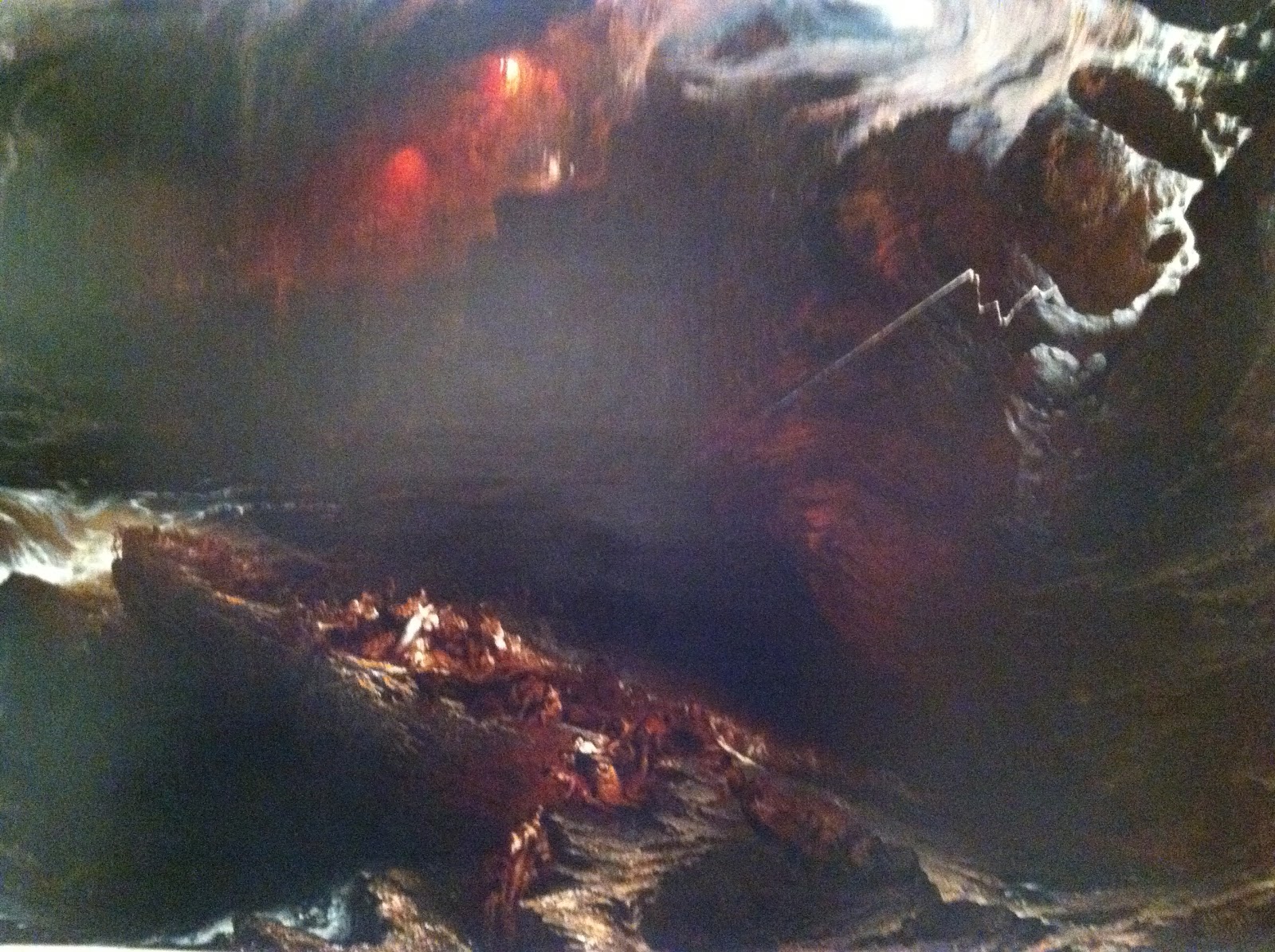

Better angle to see the waves.
This piece was very interesting to me, I did not know what the story was when I first looked at it, but it seemed to me that Hell was raining down upon the earth. The waves were so high the bright reds were illuminating and reflecting into the water. I almost seemed like a painting of the end of the world. Come to find out that it's a painting of the great flood called, The Deluge by John Martin. It was painting on canvas with oils in 1834. Martin's intention was to show the most violent part of the great flood when everything was being destroyed.

This painting is called Grace Rose by Frederick Sandys in 1866 on panel with oils. I thought that this woman's eyes were breath taking and the flowers behind her were gorgeous. One thing that I thought was interesting though, was how her pale skin almost looked less defined which made the gold necklace around her neck really pop out from the painting. This woman's name was Grace Charlotte or also known as Lady Rose because of her change in name when she married William Anderson Rose. Sandys incorporated Japanese art into the background for decoration which I also found interesting.


Close up of tiger on the left side.

Close up of lions on the right side.
This painting is called, Portrait of Mr. Van Amburgh, As He Appeared with His Animals at the London Theatres painted by Sir Edwin Henry Landseer in 1846 and 1847 on canvas with oils. I was not very interested in the man himself only because of the animals looking so frightened of him, but I loved looking at the detail in the tiger and of the lions on the right. The way that the artist made the fur seem so real and gave it a great shine was fascinating to me. Also, the piece brings emotions such as anger towards the man and sympathy towards the lions and tigers in my opinion. I felt bad for the animals.


I thought that this painting was so cute. It reminded me of when my sister had her guinea pig. Before she got it, she looked just like the girls do in this painting. She looked sad when my mom said maybe and excited when she saw them and knew she could get one. My mom looked just like this mom did as well, knew that it was another pet that she would end up taking care on instead. The painting is called Selling Guinea Pigs and was created on canvas with oils by George Morland in 1789. At this point in time, paintings that had a domestic scene was growing in popularity which influenced this painting.

I thought that the colors in this painting worked very well together. The bright pink caught my attention first and then the bright moon in the blue sky. The silhouette of the ship added to the feeling of sunset as well. The painting is called, Vesuvius from Posillipo. It was created by a man named Joseph Wright of Derby in 1788 with oils on canvas. The pinks were inspired by a volcano and the bright reds and pinks it gave off when it erupted. Although there is a volcano erupting in the background, for some reason, the painting is still peaceful.


Closer view of the painting.
This piece is called St. Paul's Cathedral created by Canaletto with oils on canvas in 1754. The detail on the building is amazing. I love the use of shadows in this composition to give the building depth. I also thought that the people on the street were very interesting and showed everyday life for them they each have their individual story and uniqueness. With the buildings far off in the background, it allows for the viewer to feel as though there is a separation between the church and the rest of the city. The use of the pinks and purple blended into the sky also gives the sense of the sunset coming and I thought that it made the piece look even more beautiful.


Close up of the blacksmith in the middle.
This piece is called The Blacksmith's Shop created by Joseph Wright of Derby in 1771. This painting was created on canvas and the oils helped to create the stunning glow of the blacksmith and the sweat on the men's faces. The artist did an amazing job bringing the focus of the painting to the middle with the illuminating light and the dark shadows that were created because of the light. The artists intention was to get as much detail into the painting as possible and I would say that he was quite successful. The painting is suppose to have religious overtones and reflect images of the Nativity. It symbolizes the dignity of human labor, strength and skill.

I was able to go to the Johan Zoffany exhibit and take two pictures. However, I did write down some of the paintings that I liked that I couldn't get pictures of and two of them were a picture of Upper India and Plundering the King's Cellar at Paris. They were both very interesting pieces and if you choose to go to this museum, I recommend taking a look at these pieces.


Close up of right side.
This painting is called Self Portrait with the Artist's Family created in 1802-3 and was painting with oils on canvas. At this point in the artist's life he was semiretired and spent much of his time at home with his family and listening to music. I found in interesting that the daughters and grandson were much less defined than he is. He has bold shadows definition in his darker colored clothing. I was glad to see that he was smiling in this portrait as well. It shows that at this point in his life, he was very happy.

Once the guard informed me that I could not take pictures of the exhibit, he allowed me to stay this far away and take the picture so it's not a very good picture and the picture below this one is a zoomed in picture and therefore is a little blurry so my apologies.

I thought that this painting was very interesting. I thought that the long pieces of fabric and the expressions on the people's faces were very well done. I also thought it to be very comical with the angels playing on the fish and playing with its fin. This painting is called The Triumph of Venus created in 1960 on canvas using oils. It was interesting to see another Greek myth being used to create another beautiful work of art.

And that concluded my visit to the Yale Center for British Art. It was a wonderful day with my mom and I suggest taking some time to visit this wonderful museum.
Wow... an extensive photo survey with comments... well done!
ReplyDelete